Compiling with DHCP🔗
Introduction
I've read an article from Vincent Sanders (which I found from Planet Debian) about compiling data with a little script and gnuplot for presentation. I think it is a good idea and it could be extended to a bunch of internal datas of my own…
Let's start with DHCP leases from the logs of my home server !
First, we have to extract data from the log file. Then, we will use a gnuplot script to draw data.
First part: extraction tools
First, you have to find a log containing the DHCPOFFER statements. Those strings indicate what computer (by its MAC adress) is offered a true IP adress from the DHCP server and also the date and time of the lease's start. E.G: Oct 12 16:39:30 debianplug dhcpd: DHCPOFFER on 192.168.0.11 to 00:FF:01:01:01:01 via ethX
So, you have to find the files and to concatenate them (I guess that the order doesn't matter as gnuplot can sort the data) with cat or zcat. For my logs, those statements where found in the messages or in the syslog files. Here is an example of concatenation command:
zcat -f messages.4.gz messages.3.gz messages.2.gz messages.1 messages or zcat -f messages*
The output of this command is a complete list of the messages log.
Then you have to select the DHCPOFFER statements with grep like this:
zcat -f messages* | grep DHCPOFFER
The output of this command is the list of the DHCP leases offers from the DHCP server.
Finaly, you'll have to reorder the output to build a data file that can be used in gnuplot:
zcat -f messages* | grep DHCPOFFER | awk -F " " '{ print $2"/"$1"_00:00:00\t10/Jan_"$3"\t"$10"\t"$8}' > dhcp.dat
You've got your data file (dhcp.dat) which contains the following data:
…
9/Oct_00:00:00  10/Jan_18:52:39 00:FF:01:01:01:01       192.168.23.87
10/Oct_00:00:00 10/Jan_10:42:27 00:FF:01:02:01:01       192.168.62.56
…
We have to modify the date and the time statements due to gnuplot unable to use two different time formats for the time data.
GNUPlot in action
Now, let's trace the plots:
You'll have to modify the xrange with the dates you want to see. Of course, we bet that you don't log more than a year of DHCP logs…
Lauch gnuplot: gnuplot dhcp.plot and you'll find a graph in dhcp.png like the following one:
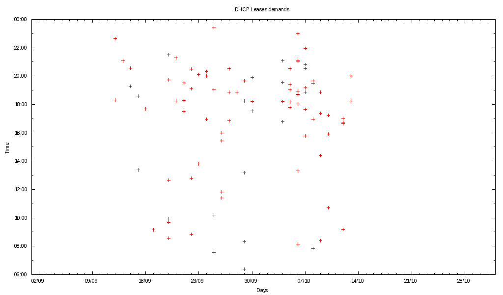
Nice graph !
More from Unix commands
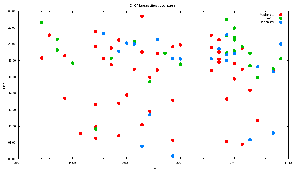
But there is something that needs to be done: at home, I've got 3 computers that are used by the whole familly. So I want to see if there is a way to differenciate the computers by their MAC Adress. For the moment, the only way I've found is to separate the dhcp.dat file with a sort and a pattern.
Here is the command:
for f in $(awk -F "\t" '{print $3}' ./dhcp.dat | sort | uniq); do grep $f dhcp.dat > "$f".dat; done
You've got N files named
Now you can represent each file under gnuplot. Here is the little modification of our latest script:
You can obtain the plot statements with this command:
for f in $(awk -F "\t" '{print $3}' ./dhcp.dat | sort | uniq); do echo "$f.dat using 1:2 title '$f',\\"; done
My guess is that you 'll have to translate the Mac adresses into human readable names in the titles.
Here is my final graph:
Conclusion
Within a few hours, you can represent the data that are kept in your logfiles without to use other tools than Posix commands and GNUPlot. In this example, with the final graph, I can see that my computers are started (because when you want a DHCP, it means that the computer is starting) around 17:00. I've also found that the kids do not start the computer just after they've got back from school… But they keep some time to do their homework before. On Wednesday, the computer they use is started after lunch.
Truth is better than Beliefs !